The Rise and Fall of Minimalism in Branding
Over the last decade, the trend of minimalism in branding has become almost unavoidable. Everywhere you look, brands have been flattening, simplifying, and streamlining their logos in an attempt to appear more modern and adaptable across digital platforms.
In theory, it makes sense. Simplicity scales well. It works on phones, websites, social media icons, and even billboards. But somewhere along the way, simplicity turned into sameness. Many brands lost the very thing that made them distinct.
When minimalism becomes the goal instead of the tool, it stops serving the brand and starts diluting it. And few examples illustrate this better than the Toronto Raptors.
How the Raptors Lost Their Edge
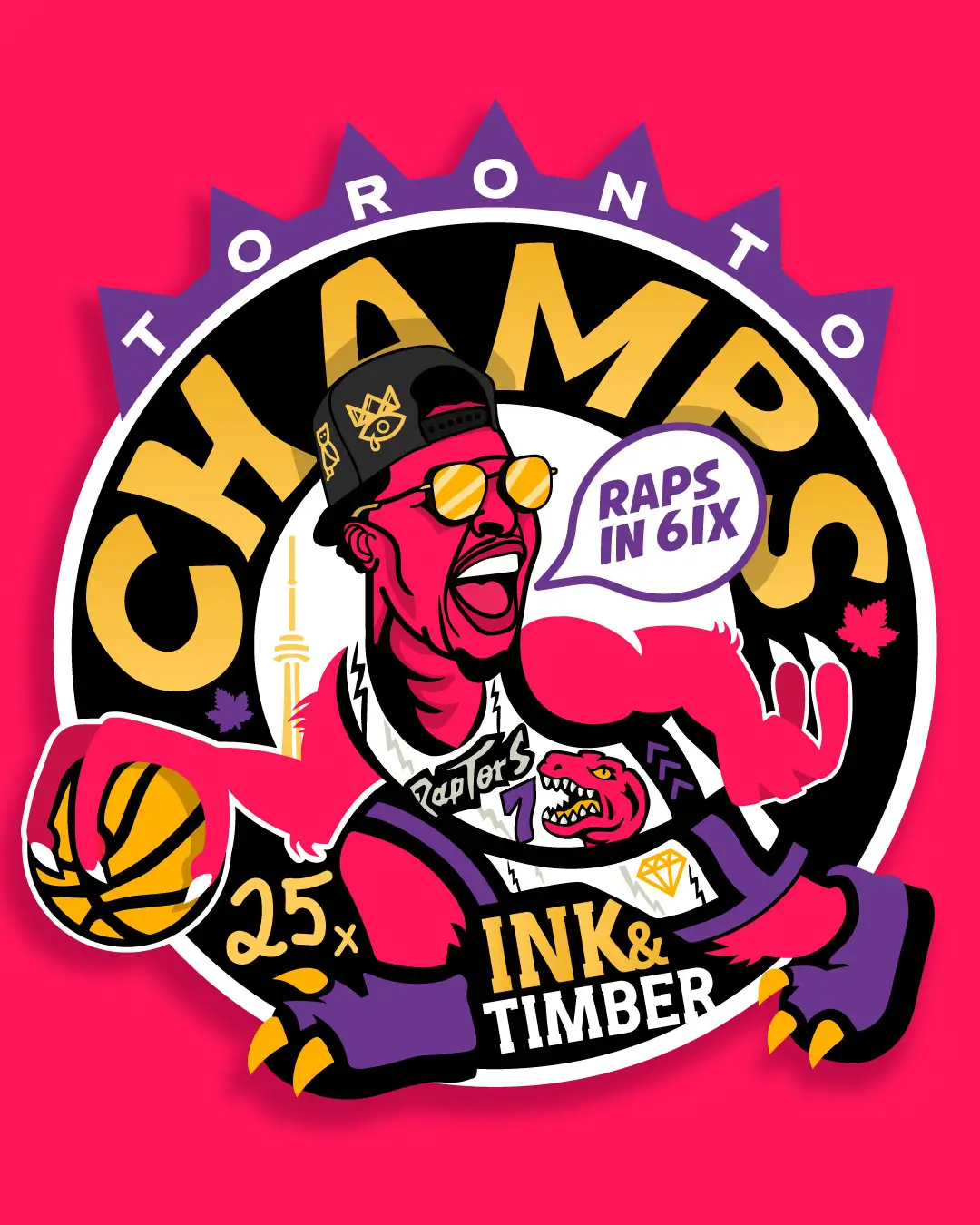
When the Raptors joined the NBA in 1995, they had one of the most memorable brand identities in sports. That wild cartoon dinosaur, paired with a fearless mix of purple and red, gave the franchise instant character. It was bold, playful, and unmistakably original.
It didn’t try to fit in. It stood out.
Over the years, as trends shifted, the Raptors began refining their visual identity. Eventually, they landed on a logo that is technically clean and modern but visually bland. A silver basketball. A few claw marks. A circle.
It is minimalist, yes. But it also feels hollow. It could belong to any team in any league. It lacks the personality, humor, and energy that made the original design so memorable.
In trying to look timeless, the Raptors ended up looking forgettable.
Why Fans Still Love the Original
The proof is in the marketplace. Fans have voted with their wallets.
The demand for retro Raptors gear remains massive, years after the original branding was retired. Those purple dinosaur jerseys sell out regularly. The throwback hats and tees move faster than the official modern merch.
That is not just nostalgia. It is proof that the original identity connected emotionally. It was fun. It was different. It had a voice.
Minimalist redesigns often fail because they remove too much. They simplify to the point where all the personality and storytelling are gone. The brand stops feeling human.
A strong brand identity does not need to be loud or complex, but it must be memorable. People connect with character, not geometry.
Minimalism in Branding: Lessons for Businesses and Designers
If you are thinking about a rebrand, the Raptors example is worth remembering. Design trends come and go, but your brand’s story is permanent.
For a deeper dive into how logo designs evolve, check out our post on the ‘Evolution of Branding: From Ancient Symbols to Modern Branding‘.
Ask yourself:
- Does this new look still capture our original essence?
- Will it mean something to our audience five years from now?
- Are we simplifying for clarity, or are we erasing our identity?
Minimalism is powerful when used intentionally. But it must always serve a clear purpose. Otherwise, it becomes visual noise disguised as refinement.
Great brands evolve, but they do not abandon their DNA.
If you are facing an identity crisis, our brand strategy roadmap can help you define your unique DNA before you attempt a redesign.
The Future of Brand Identity
In a world full of clean, flat, and neutral logos, character is now the greatest differentiator.
Brands that dare to keep their quirks, color, and emotion will stand out. Authenticity has more staying power than any design trend.
Your brand should not whisper to the crowd. It should roar.
Originally inspired by a discussion I started on LinkedIn about the Toronto Raptors and the pitfalls of minimalist branding. Join the conversation there or reach out if your brand is facing a similar identity crisis.


[…] trust from the moment someone lands on your page. If you missed our last article, catch up on why minimalist branding often fails. Choosing a developer who understands your business ensures that your website becomes a true […]